~written by Jason Caulkins, Dataram Storage Blog Team Member
Starting back in the 1980s (and even prior), work was being done to identify how cache affects application performance in a typical compute environment. A very good series of work was done at IBM, the University of California, Berkeley, and a host of other institutions. Much of this work was facilitated by using “storage traces”. Once a real-world IO workload could be isolated and recorded to create a “storage trace”, one could then take the storage activity and play it back, without actually performing any of the CPU or network activity. This allowed researchers to isolate just the disk IO workload and measure performance of disk subsystems, cache, and various tuning algorithms in order to gain a better understanding of their independent impact on storage IO.
This paper focuses on the work done on cache size and location. An important contributor in this field is Dr. Alan J. Smith with the University of California, Berkeley. His paper “Disk Cache – Miss Ratio Analysis and Design Considerations” (reference) written in 1985 is one of the first works that analyzed and demonstrated the effect of cache size and location on standard computing workloads.
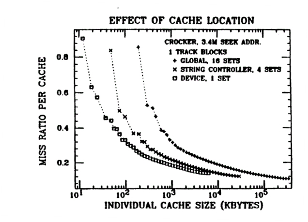
He measured the effect of cache size at various locations in the compute hierarchy. His measurements are graphed in terms of “Cache Miss Ratio” and “Cache Size”. An example is shown below:

Figure 1
(Source: Smith, Allan J. Disk Cache – Miss Ratio Analysis and Design Considerations. 1985)
The graph in Figure 1 shows a couple of very interesting behaviors. First, it shows that regardless of cache location, there is a diminishing benefit for increased cache size (the curves are steep at the beginning then flatten out quickly). Second, it shows that the location of the cache is most effective at the device, then the controller, and lastly “Global” (system RAM). This is indicated by the curves that are closest to the left (smallest cache size for given miss ratio).
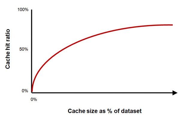
Fast-forward a few decades and the work has been expanded and tested in the real world. We now talk about “Cache Hit Ratios” because that seems easier to communicate, and also produces graphs that are more intuitive. Below is an example of a modern, generic “Cache Hit Ratio” graph:

Figure 2
The graph in Figure 2 is expressing the same behavior, but is expressed for one location (in this case the controller), the vertical axis is expressed in % Cache Hits (vs. statistical misses), and the horizontal axis expresses cache size not in absolutes, but as a % of the dataset size. This is obviously greatly simplified, but makes understanding the principals more straight-forward.
The exact shape of this curve will vary based on the workload, system performance and many other factors, but those can be expressed as coefficients that flatten or exaggerate this same basic shape.
In examination of these graphs a few questions may come to mind:
- Why is the cache more effective closer to the storage device?
- Why do data access patterns for compute workloads behave like this?
- Why is the cache so effective in relatively small sizes, then has a declining benefit?
The answer to question one really has to do with relative performance and locality. The CPU has cache which is very fast and very close to the CPU. It provides similar benefits to the CPU’s workload that storage cache provides to the storage workload. However, this cache is too costly (thus cannot be practically grown with the dataset) and too remote to the disks to provide any significant real-world benefit for a storage workload. In addition, storage cache must be treated differently, as it has to have a means to protect the data in the event of a power loss. So, in essence, the highest-performance location of the cache in the storage hierarchy has to do with proximity to the final “resting place” of the data, and to the vast speed difference between the cache layer and the storage device (disk) layer.
The answer to the second question, “Why do data access patterns for compute workloads behave like this?”, has to do with the nature of real-world, structured data access. In most compute workloads (desktop, financial, database, scientific) certain data is accessed much, much more frequently than others. For example, file system file allocation tables, database Index files, re-do logs and the most current dataset or record are accessed very much more often than “old” or “cold” data. Since these data types are so frequently accessed, having them in local storage cache greatly improves overall system performance.
The answer to the third question, “Why is the cache so effective in relatively small sizes, then has a declining benefit?” is that, by design, file allocation tables, index files, re-do logs and individual records are much smaller than the total dataset and therefore tend to fit nicely in the right-sized cache, and since they are so frequently accessed the benefit is great.
Please come back for Part II which will examine the implications of these behaviors and establish some rules of thumb on how to properly size your cache for a given dataset size.


